
Power BI tips & tricks: from insight to action
17 December 2025
On 12 November we hosted a hands on Power BI masterclass for finance and audit professionals at our Rotterdam office. The session focused on building reliable models, transforming data efficiently with Power Query, and writing accurate DAX formulas. We also explored how low code solutions make it easier to move from insight to action by integrating dashboards directly into decision making processes.
In this article we share the key lessons from the masterclass, together with practical tips to help you turn Power BI dashboards into valuable insights — and translate those insights into action.
In this article we share the key lessons from the masterclass, together with practical tips to help you turn Power BI dashboards into valuable insights — and translate those insights into action.
Case study: month‑end close
It is 5:45 pm on day three of the month‑end close. The controller notices margins under pressure in two entities. In a traditional workflow the team exports spreadsheets, cleans data, requests approvals by email, and hopes for timely responses. By the time the final report reaches the CFO’s inbox, the figures are already outdated.
Now imagine the low‑code approach: a Power BI dashboard automatically detects the deviation and immediately displays the correct entity and period in a dynamic title. Power Automate then sends a Teams notification with a direct link and a pre‑filled checklist. Through a Power Apps form the corrective action is recorded, approvals are routed, and supporting documentation is captured. The dashboard refreshes automatically, including annotations, fully audit‑ready.
No coding is required and no time is lost; it is an end‑to‑end approach that converts insights directly into action while remaining transparent, reproducible, and continuously improving.
This scenario is not a distant prospect but the reality of finance when dashboards and automation come together. To achieve that success, a solid foundation is essential, and the tips below will help you build it, ensuring your dashboards are not only visually appealing but also genuinely support decision‑making.
Practical tips & tricks you can apply straight away
1. A model for clarity and speed
Start with a star schema to develop reliable and scalable dashboards. Link core data such as the general ledger, sales, and budgets to clear dimensions like date, entity, and account. By consistently reusing these dimensions across all tables, slicers remain consistent and time intelligence — such as rolling 12 months or year‑on‑year — is applied reliably.
Place business logic in measures rather than calculated columns. This ensures results respond instantly when a manager opens an alert via a deep link. Create a separate Measures table and use clear names such as Revenue and Gross Margin. This makes variance charts and dynamic titles easy to find and dependable.
Avoid anti‑patterns: practices that may seem convenient in the short term but cause problems later. Examples include using multiple date columns or text keys with inconsistent capitalisation. Ensure data is transformed consistently in Power Query and use numeric surrogate keys wherever possible.
2. Clear DAX for better performance
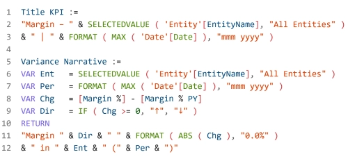
Write DAX formulas so they are not only correct but also easy to understand and maintain. Use VAR to perform calculations once and make your intent explicit. Build calculations such as Rolling 12 Months and Year‑on‑Year on a properly marked date table, so alerts show trends rather than noise. Add dynamic titles and explanatory text for deviations directly in the DAX measure, so context is clear without further discussion.
Placing this explanation alongside a KPI card turns a static figure into a story. And that is exactly the information a controller needs at a crucial moment, such as 5:45pm during the month‑end close, to make the right decision immediately.
3. Power query: prepare once, refresh always
Organise Power Query processes into clear layers: Bronze for raw imports, Silver for cleaned joins, and Gold for tables ready for the data model. Set parameters for file locations and dates so you can easily switch between environments. Give each step clear names, such as Merged ChartOfAccounts or Standardised Currency, so your pipeline reads like a process rather than a puzzle.
Aggregate large tables in advance wherever possible. Smaller inputs mean faster visualisations, which is crucial when an alert must load instantly. For large datasets you can also configure incremental refresh with RANGESTART and RANGEEND parameters, ensuring the month‑end close runs smoothly and efficiently.
4. From insight to action: design with purpose
Design each report page to answer one central question and always end with a clear next step. Use Field Parameters to switch between measures or dimensions within a single visual, providing clarity and overview. Guide users through a logical drill‑through structure, from overview to deviation and then to root cause, and support common workflows with bookmark navigation.
Integrate action directly into the report so users can move seamlessly from insight to execution. For example, add a button Resolve Deviation next to the KPI that opens a Power Apps approval form. This form can be pre‑filled with the relevant entity, period, and deviation value. With this direct link from insight to action, your dashboard becomes a true decision‑making instrument.
5. Quick performance optimisation
Use the Performance Analyser to capture interactions within your report and start by improving the visuals that respond most slowly. Remove unused columns, limit functions such as DISTINCTCOUNT, choose numeric keys, and shift heavy aggregations to Power Query. These optimisations significantly reduce load times. Aim for your key KPI page to be available within two seconds, as speed is critical: it increases dashboard adoption and prevents controllers reverting to Excel.
6. From analysis to execution: ensure continuity
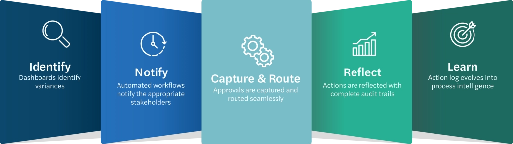
Dashboards make deviations immediately visible, while automated workflows inform the right stakeholders, approvals are efficiently recorded and routed, and all actions are logged with full audit trails. Over time this action log evolves into valuable process intelligence, showing which measures are truly effective and where policy adjustments can prevent future issues.
You strengthen decision‑making by adding context alongside KPIs, such as the last action taken, the responsible person, and resolution time. Combine dashboards with buttons for quick corrections and explanatory text for deviations. With these smart design choices, analyses become more than insights — they drive concrete actions and continuous improvement.
7. Trust as the foundation
Low‑code solutions are only truly successful when governance and control are firmly embedded in daily processes. This means working within managed environments, using structured deployment pipelines, and applying role‑based access rights to mitigate risks. It is also advisable to automate the recording of approvals and full data lineage, ensuring every value remains traceable and explainable. With these safeguards in place, low‑code and no‑code solutions are no longer seen as an uncontrolled risk but as a strategic instrument that strengthens the finance function.
8. The future of finance starts here
Digital transformation is not about tools but about results. With Power BI and low‑code automation, your finance team moves from reporting to real‑time action, from unexpected month‑end closes to predictable performance, and from approvals via email to fully auditable workflows. Together we can build that future step by step: one insight, one action, one closed process at a time.
Want to know more?
